
Interviews
08
Mar
Drawing as an experiment
- By Jean Wilkey
- One Comment
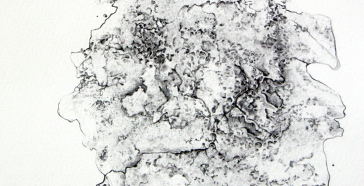
Drawing as an experiment in controlled chaos: an interview with Jenny Core
Jenny Core’s work explores the perimeters and the possibilities of mark-making. Her work is as once delicate and substantial, compelling and intimate. It draws you in close and you can loose yourself in it, spending time exploring its nuanced lines and shapes. Her approach to art-making is novel and is an exploration of the effects of the media itself on the outcome of the final work, in much the same way as Cai Guo Qiang’s [http://www.caiguoqiang.com/] gunpowder drawings are controlled experiments in art-making. She recently answered the following questions about her work from Jean Wilkey for Unframed.
Jenny, you mention that your work is about an investigation into the “potential and diversity” of drawing as a medium. You’re integrating the process of art making into the exploration of its potential in using actual objects or materials that disappear in the process. The method of creating is important to the finished drawing but we don’t get to see that process in the final work – only it’s remnants. Experimenting with the effects of the medium itself on the drawing is almost like a chemist experimenting with substances. This is a very conceptual approach to making art.
Jean Wilkey. Can you tell us why this approach interests you?
Jenny Core. Over the past 60 years, drawing has become more prominent in the art world as these sketches, lines and marks have come out of the privacy of the artist’s sketchbook’s and are available for the world to see. With more and more artists using drawing, I wanted to explore what drawing could be and investigate how we could define drawing as a medium. In my current research I believe drawing, in its broadest sense, is mark making. I am fascinated with the idea of drawing with objects instead of observing objects – concentrating more specifically on the act of drawing itself.
Drawing interests me as I love how unique the medium is. Creating a mark, which cannot be made by anyone else.
JW. What path have you followed to get where you are currently in your work? Tell us what you were doing before and how your work evolved into this approach.
JC. I have always used drawing but I used it more as a preparatory process instead of a final outcome. My drawings originally helped me realise short films and installations but the more my pencil hit the paper, the more interested I became with drawing itself.
JW. Please tell us a little about your influences and inspirations.
JC. What feeds my practice is ideas of play. I love all work that are experimental and process focused such as the works of artist Francis Alys. [http://www.francisalys.com/] I am inspired by people that transform mediums in an almost alchemic fashion, pushing the boundaries of their materials and making us see things differently, such as the works of artist Mary Griffiths. [http://marygriffiths.com/art/]
JW. Even though your focus is exploring the potential inherent in mark-making, the process and materials seem integral. Can you give us some specific examples of how you are using the materials in making the work for ‘Form’, and elaborate the “time led and performative” aspects of the work?
JC. My favourite part of creating my works is making objects to draw with. I love capturing the energy and essence of an object, giving its presence permanence on paper. I have created objects using frozen ink and water solution and allowed it to melt and spill over paper. Another process I have used is ink and bubble solution. I capture the bubbles on paper, which create energetic forms that I then manipulate with inks and pencils. The works shown in ‘Form’ have been realised by using graphite powder and water. When the water hits the graphite powder, it creates metallic forms. In a print style process, I press the paper into these objects, which results in a marbled marks that I then work into with graphite and watercolour.
JW. What excites you the most about working this way?
JC. What excites me the most about working this way is its contradictory process. It starts with chance and play. Creating objects and capturing them and having very little control over the outcome. To then drawing detailed lines and manipulating the marks. You could say I am trying to control the uncontrollable; creating order to chaos.
JW. Do you finish your pieces in one session or over many days or weeks? The work seems highly related. Does one piece evolve out of the other or are they discrete responses to what is happening with the materials?
JC. The works in ‘Form’ have been created using graphite powder and water solution. I create the solution and press the paper into it. One batch of solution can create up to five different pieces, which all show very similar shapes due to this print style process. I never ‘finish’ a piece in one sitting. I work on several at the same time. I prop them up in front on me as I work on one. I add detail to one piece and place in front of me and then select another piece to work on and so on. Weeks can pass until I have decided if it is the finished article.
JW. What do you want the viewer to take away from this work?
JC. Pareidolia (the phenomenon of searching for significance in imagery such as clouds etc) is the underlining theme in this series of work. I want the viewer to have their own experience with the work and see things no other can see.
JW. How long have you been making art and what do you think has helped your development the most?
JC. I have been making art professionally, outside of the institution, since 2009. However, I imagine this is the same for all artists, I have been creating since I could hold a pencil, my love for art grew from there. I feel my work has really developed over the past couple of years. There has not been one specific event that has shifted my way in working, just a long series of research, experimenting and collaborations.
JW. What does your typical workday in the studio look like and how often do you get to work on your art?
JC. I work on my artist practice full time, but a lot of my time goes into marketing my practice, applying for opportunities, finance and networking. On an average working week I get 2/3 solid working days of creating. This alters depending on commissions and deadlines. These are my favourite days!
JW. What is on the horizon; what do you dream of doing next?
JC. I am working on a project called The Drawing Project. This launched in February 2014 with an exhibition at Castlefield Gallery in Manchester (UK), funded by the CG Associates Scheme. The Drawing Project is a research project led by myself. The project has been created to investigate the current approach to drawing, considering specifically how artists define and use drawing in their practice. I want to expand on this project, creating opportunities for artists working in drawing and open up a platform for research and skills sharing alongside publications and touring exhibitions. I am currently looking in to funding for this. More info here: http://thedrawingprojectnorthwest.wordpress.com
JW. Is there anything you’d like to add?
JC. Thank you for selecting my work for your online gallery.
10
Feb
Digital Artists on iPad App Art
- By Zoe Spiliotis
- No Comments
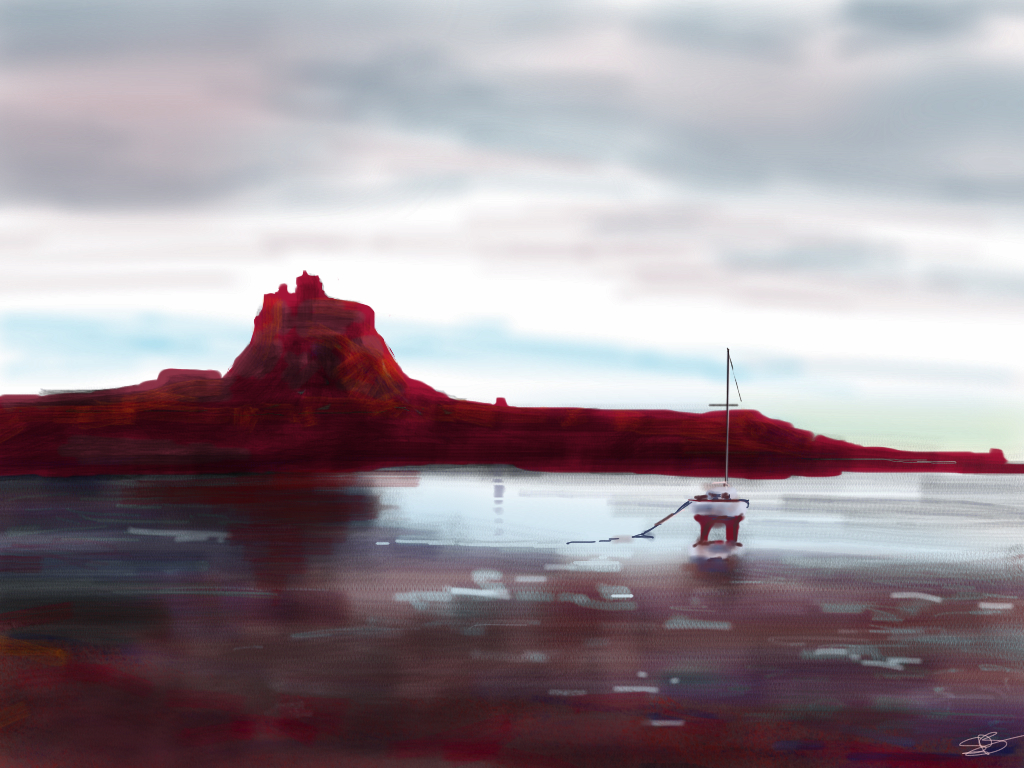
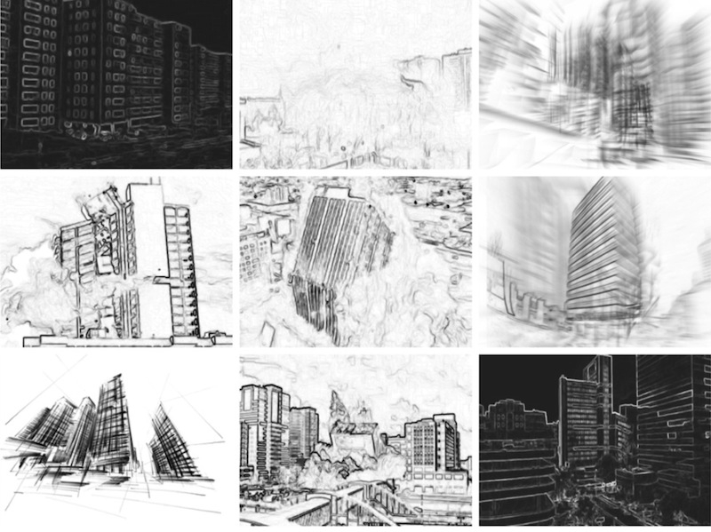
During the preparation of our group exhibition, DIGITAL, it became clear that iPad drawing apps were having a big effect on artists and the types of digital works created. Certainly they are appealing to all levels of artists because of their portability and ease of use. Some of my personal iPad favorites have come from artist David Hockney. And although one might think iPad App art is mostly for sketching, it is becoming clearer that these apps can produce a much broader range of art. I asked a few of the artists, Steve Thompson and Jordan Rodgers, from our exhibit to give us their take on App Art.
Why the iPad? or How did you get started using the iPad app for drawing?
Steve Thompson: Clean and portable the iPad became my sketchbook soon after it was launched.
As everyone knows it gives access to a huge amount of apps, some of which are dedicated to art.
My favourite app is Sketchbook Pro. which allows smooth contoured finger painting.
Jordan Rodgers: Since 2011 I’ve been using the iPad to push the boundaries of drawing through utilizing enhancements in modern technology that offer a new perspective in contemporary visual arts practice.
ST: I haven’t used them since taking up the iPad but by big thing was oil on canvas.
What have you found, are the advantages or disadvantages to creating drawings on the iPad?
ST: The biggest drawback is the black screen in sunlight.
The most singular, spectacular advantage to me is layers, this allows you to paint underneath an
existing layer which I’ve always found pretty tricky to accomplish with oil.
JR:I work fast and press hard onto the screen of the iPad, I have been known to break a number of stylus pens so nowadays I tend to work from finger touch and overall I find the latter allows for greater rhythm and flow while drawing the lines machine-gun style.
What do you enjoy most about working on the iPad?
JR: It is how we respond and react to changes in technology that I find thrilling. However, nearly everything we engage with in art at one time or another can be as much described as cutting edge. But as time goes by such technology will become old news and the validity of the artworks itself may be all that remains.
How do people normally react to you work when they find out it is digitally produced?
ST: Wow! how did you do that! If I show them on the iPad.
When seen printed to canvas quite a few people have likened it to acrylic.
Actually, thinking about it, there hasn’t been a negative comment.
JR: It is important to engage with the viewer and draw them into the process of looking. With consideration toward exhibiting my drawings on a small scale handheld device to one that through installation creates an experience almost of stepping into the environment.
How long did it take you to develop your skills on the App until you felt satisfied with the results? I am assuming you had to teach yourself the skills as there really aren’t any drawing classes yet for App drawing. How did you do that?
ST: It didn’t take to long before some pleasing results were coming through, if you have experience with a brush or pencils
it’s only a short step to using your finger! Sorry, that was a bit glib, I quickly discovered through online forums (sketchbook pro has one) that a stylus was a much better ‘finger’ and that one of the joys of the internet is that so many people are incredibly generous with their knowledge.
JR: I draw as both a passion and purpose. My work was good enough for others to follow, ideally that’s what that any artist wants to be isn’t it? A trendsetter. It is desirable, then to be a child of the revolution under the conditions of today’s technological aid by presenting a dawn of drawing in a new age.
I want to thank Steve and Jordan for take the time to ansawer a few of my questions. Make sure to check out the rest of their work and the other artists in our digital exhibition which is up on unframed.us until the end of February 2014.
For more information on them visit:
www.jordanlrodgers.com or @jordanlrodgers
04
Dec
Artist Interview: Debra Franses Bean
- By Adrian
- No Comments
A CONVERSATION WITH DEBRA FRANSES-BEAN
By Jenni Higginbotham
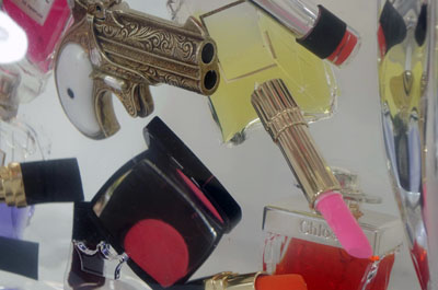
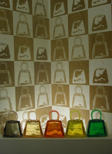
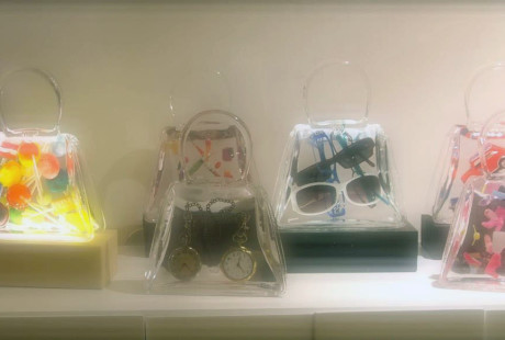
Debra Franses-Bean’s “Art Bags” are frozen moments of consumption, of eating your cake and having it, too. A series of identical, crystal-clear handbags contain a plethora of desirable objects—often the kind whose appeal is short-lived. Take Yum for example: an Art Bag full of colorful Gummy Bears. The Gummy Bears are suspended in the clear resin, preserved forever in the belly of the handbag. They are consumed, but not digested. Mummified in their chic resin coffin, they are satisfying in a way that the actual experience of eating a handful of gummy bears cannot be. Other Art Bags contain wads of cash, slick handguns, designer lipstick tubes—and all manner of objects denoting a level of comfort, prestige, and style. In my conversation with Bean, she sheds some light upon her artistic process, her often-humorous relationships with collectors, and some of the autobiographical content of her work. In addition, she discusses her position as an artist working in both the commercial and fine art realms.
JENNI HIGGINBOTHAM: The first thing I’d like to talk about is your basic process of making the Art Bags. How do you make them? How do you try to perfect them?
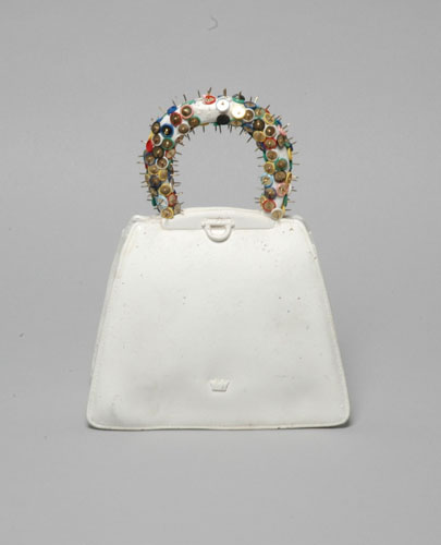
DEBRA FRANSES-BEAN: I’ve been making the Art Bags for over 10 years. Same thing, same signs, same bag, different contents. I stumbled upon the handbag motif when I was at St. Martin’s, and we were asked to bring in an object to class. I suppose, like most artists, that I an interested in the psychological side—that sense of self-discovery. A very big part of my life is my father, and he’s been in the handbag industry. So all my life I’ve been given handbags, these receptacles for my dolls and toys. They were like my grownup toy. They were just so intrinsic to the basic idea of carrying things, whether it’s actual stuff or the “mental bits that you hang onto,” and they are a rather obsessive object. I’ve been making the same bag shape this whole time.
The very first handbag I made was created with plaster, and the handle is covered in sharp pins. It’s called To Have and To Hold, and obviously if you do hold it, it will be extremely painful, and your hand will get pricked. When I made this I had just gotten married, and in some ways this was a psychological comment on marriage. These bags have followed me through my every move and path of life. They’re very intimate and autobiographical.
JH: That’s interesting because I was thinking of them in a really conceptual mode. You clearly work conceptually as well, but I really like the autobiographical aspects of the handbags. It’s also interesting to think about artwork commodity-wise, creating a perfect product for your intended audience or clientele.
DFB: The kind of people who respond to the work are generally people with quite a lot of money, and by “respond to the work” I mean “buy the work.” They just tend to be a certain type of person. It’s difficult in some ways because I’m partly catering to them, and I’m partly just bobbing along in the world being myself. It’s tricky because it’s become quite commercial. These people want something that’s finessed and polished. The direction I’ve taken the work in is very much that striving for perfection. You don’t ever really achieve that, and it’s that constant failure to perfection that keeps me going. It’s almost what the work is about.
My latest bag (not featured in the exhibition) is actually a 3D printout. It’s the same shape but a lot bigger. I scanned the handbag shape and printed it, and it’s coming along, but I’m struggling with it at the moment. With some other resin bags, I have been working with Chanel #5 bottles, and every time I put the new pieces full of Chanel #5 perfume bottles they keep exploding and turning into piles of goo. Making a mistake with these bags is very expensive. I’m working through it now.
JH: So you have your mold, and you pour a little bit of resin in. Then you place the objects into the mold and fill it up the rest of the way?
DFB: Yes. Often there can be up to 6 layers with different depths of objects in it. Then you seal it up, pour the last bit of resin in, and there you have it.
JH: So at what point do the bottles explode? Is it the heat?
DFB: I’ve figured out that modern Chanel #5 bottles are not the same quality as the vintage ones. Buying vintage ones, which I usually buy on eBay, are so expensive that I started buying the modern ones. I’ve now gotten to the point where I’m casting the Chanel bottle. I’m basically extracting now, and they’re now even more removed from the real. They are becoming more complex and ambitious.
JH: So instead of just plunking objects into the resin, you are creating these entirely new objects based on the “real” ones to place in the bags? That is definitely more complicated.
DFB: It is a labor of love, the way I see it. I look at the Art Bags as a life project. They’re about my life, and they follow me. They go to places that I’d like to be right now—like Palm Beach. They hang out with the rich and famous.
JH: Yes, and as a woman, handbags have often defined my different life stages.
Reading your artist statement, you partly describe your work as a sort of mish-mash of immediate gratification and guilt. When you want something you say, “Oh, I really want this.” Then you have whatever it is, and suddenly it isn’t quite as good as you thought it would be. For example, the Art Bag Yum is filled with gummy bears. They’re so pretty and sweet, and you can’t help but want them. But after you stuff yourself with them, you feel guilty. These grown up handbags contain almost childish contents. There are a lot of complex ideas and emotions wrapped up in these Art Bags. Could you elaborate on that?
DFB: You think about being able to discreetly hide things in your purse, but these bags are open to scrutiny from the viewer. They let you into the secret psyche of this “person” who is really quite normal. But we don’t show all aspects of ourselves. These bags are stripped back to show our basic instincts—like the desire to have a gummy bear or a lollipop. And there’s that funny feeling that you have when you’re a mother, and your son or daughter sticks their unwrapped lollipop in your handbag. So you reach into your bag in some smart store, and there’s this sticky lollipop in your bag. There’s definitely a humorous aspect to the work. Also, the gummy bears are a very iconic shape, and I was playing with iconic shapes. I decided the handbag was an iconic shape, and being the artist, I wanted it to be my own iconic shape.
There’s a bit of a double entendre with the lollipop bag, Sucker, as well. There is a sexual innuendo to this title for a woman or for a man who may be buying a purse for his wife or lover. It plays with the notion of spending a lot on a designer bag that will be out of fashion next season. It begs the question, “Who’s the sucker here?” He’s the sucker, and she’s the sucker. Even though it’s an innocent, little, childlike lollipop, it contains a whole world of meanings. I don’t know if that comes across in the work because I think people often take them at face value. “Oh, that’s pretty. That’s a cool object.” But there’s quite dark subject matter being explored with them as well.
JH: Absolutely—like with the one titled Apothecary that contains chemo supplies. The other bags have gummy bears, lollipops and My Little Ponies, but the chemo supplies are this grim reminder that a lot of the products of our culture are poisonous. It’s such a personal piece with the contents of your chemo cabinet. It hit me like a punch in the stomach.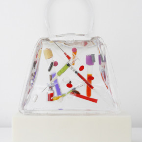
DFB: Let me tell you, it does. Literally. We are all held together, whether we like it or not, by our medical system and our dependence upon pills for our survival. Apothecary pays homage to that.
JH: It’s an incredibly moving piece. Then I look at the bag called Gun with the Derringer. The point of putting a gun in a handbag is to keep it hidden and secret. Here it’s exposed. I feel like women in particular are often the targets of our culture, both commercially and violently. There’s the idea of being protected by the gun, but there it is just out there for everyone to see.
DFB: You know, you usually find mace in the handbag. The gun is a little bit more extreme.
JH: Fair enough.
DFB: Gun is also a meta-narrative about our fears of terrorism.
JH: They look a lot like bags as they go through the x-ray machines at the airport. That is the very first thing I thought of when I saw these pieces.
DFB: Yes. In fact, I just had a client who bought a gun bag, a dollar bag, and the Flirt bag for his wife. That’s the one with the perfume and the pretty, little, pink hearts. It’s quite a sinister trio that he bought. The message is almost, “I love you, but don’t fuck with me.” People often buy the bags in sets, and they create their own narrative. I sold a piece with a watch, one with money, and the Apothecary piece. Those bags went together well, because if you can afford the private help you can keep yourself going with medical treatment and buy yourself some time. The combination of the three becomes a comment on time and our longevity. I suppose I deal with our mortality—my own mortality—quite predominantly in my work.
JH: Right, and all of these little objects in the bags—which aren’t necessarily meant to last for very long—are preserved forever in this resin.
DFB: Yes, and it elevates those objects’ status into “artwork.” Especially in that Duchampian Urinal way. I love Duchamp’s audacity to make people accept the everyday as high art.
JH: Do you view him as a kind of father of Pop Art?
DFB: Yes, and I most definitely love Pop Art. I lived in New York for a time, and I couldn’t get enough of it. Living in New York was something that I’d wanted to do for a long time, and I would like to get back there someday—or way out West. I love America, and I suppose that is something that came to me as a child when I would visit the States with my father. He is one of my references for the gun piece, and that is something people would not know just by looking at the work.
As a child my father was obsessed with John Wayne and his movies, so he took my sister and I on these fly/drive trips to America. He would drag us around the O.K. Corral. Two girls—we didn’t have too much interest in cowboys at the time, but we would go to the Grand Canyon or learn about the Gunfight at the O.K. Corral. Now this will tell you something about how much the world has changed. He bought a holster with a load of bullets and some replica guns, and we carried them back to the U.K. in our normal luggage. You just couldn’t do that now.
JH: I really like NY-LON, the bag with the watches, which are both stopped at the same time in London and New York? Why did you stop them at the same time, and how did you pull that off? Did you go through the trouble of having someone in New York and someone in London with separate watches?
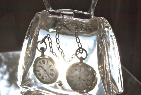
DFB: Oh, no. It’s about the tension and compression of time as well as the simultaneous lives being lived in different time zones. I actually made one that was stopped at 8:53 New York time, and it was a tribute to 9/11. It was a moment like when John F. Kennedy was killed—everyone knows exactly where they were when they received that news. It became a marker in time. For me this was a big marker in time, and though I didn’t lose anyone directly connected to myself, I felt a seismic shift in my life at that point. It was a very scary time, and I wanted to mark that moment when time stopped.
JH: So you were in New York at that time?
DFB: No, I was in a quarry on the Isle of Portland, and I was smashing away at this rock when my father called saying that this had happened. There was a moment where my father actually said, “It’s Armageddon. I don’t know what’s going to happen to us.” He said that because it was so traumatic being in England and receiving that news. Everyone was glued to the TV for hours. It was at that point where I decided to not go back to my office job again ever. I was going to go on to art school. That was the turning point where I said, “Who knows how long we’re here for?” It was then that I really understood the brevity of our lives, and I just wanted to commemorate that in a piece.
JH: That’s incredibly moving. I didn’t necessarily get that from the piece. I feel silly saying it now, but I was still thinking about it in terms of globalization and how our cultures are blending more and more as technology advances. Getting to hear your story makes this piece far more interesting and poignant than just that.
DFB: I think people underestimate the personal aspect of art, but it doesn’t matter what my thought process is. We’re free to read what we want into a piece. It matters in an interview because you have the opportunity to find out where a particular thought came from. But once the image goes out into the world, it becomes its own thing. That’s what I love about these pieces. They’re very much my own personal histories, and they are incredibly important things to me. I cherish making each piece about a particular thing, and after that it doesn’t matter. Of course, I would like for people to really understand everything about the work, but you can’t have that kind of control unless you’re really famous.
JH: It’s interesting what people will come up to you and say about your work. What is the most surprising thing anyone has said about one of your pieces?
DFB: That’s a difficult question. One time somebody asked me to make a bag with a Chihuahua’s castrated balls in it.
JH: How did that go?
DFB: Well, we didn’t end up doing it. There was a discrepancy between what the husband wanted and what the wife wanted. It was quite funny, the thought of having this Chihuahua’s castrated balls in the Art Bag.
JH: Didn’t work out so well for the Chihuahua, either, I take it?
DFB: He lives a good life, the Chihuahua.
JH: You worked with Peter Gee. His work that I’ve seen is primarily these beautiful, simple, screen prints of abstract geometric shapes. What did you take away from working with him?
DFB: Color. He was amazing. It was an exceptionally fantastic point in my artistic discovery. It was a summer in between going to St. Martins, and I had just gotten married. I said to my husband, “Look, I want to go and intern for this master.” He was part of the Factory. He was there with Andy Warhol, and he was a phenomenal colorist. I mixed colors for hours and hours and hours with him. He loved Matisse, and he did these beautiful Matisse-like paintings. That’s where I was coming from, too. I actually stayed in Provincetown for a couple of months that summer. It was a very Bohemian time. He was extremely Bohemian, and he taught me what it was to be an artist and live an artist’s life. I got together with him and this group of Bohemians while I was down there. We even met Arthur Miller. It was quite the time. There were about 4 of us, and we would go off at 4 a.m. and paint sunrises and sunsets. We would bike out with easels strapped to our backs. We thought we were the new Impressionists. I was totally about the color and paint, and I still do paint.
JH: Yes, I looked at your paintings on your website. They are reminiscent of Matisse, especially that first one on your site with the armchair and that little girl. It is called Peekaboo. I really like that piece.
DFB: Yes. That’s actually my favorite, too. I said to my web designer, I really want to take the rest off the site because that’s the direction my work is going in now. I have another one. It’s a bikini girl. It’s like a combination of Matisse and Pop painting.
JH: It’s interesting. The aesthetic seems a bit different than your Art Bags. No pun intended, but the bags are so crystal clear, perfect, clean, and bright. The paintings are so brushy, gushy and lush in a very expressive way.
DFB: Yes, and I am in them, literally. Peekaboo—that’s me behind the sofa. Splash—that’s me behind the pool. That’s where I’m going with the paintings now. I’m stepping out from behind the handbag a little bit, and I’m featuring in my own paintings. But it’s me and it’s not me. I’d like to be that skinny, for one thing. It’s vain. It’s an “if I could, I would” sort of thing.
Speaking a little bit about vanity, there’s another handbag that’s full of these designer lipsticks. It’s about consumerism, and also so much of it is about moodiness and the subtle differences that we only notice as individuals. “I just have to have the latest shade of red. I just have to!”
JH: I’m a little bit of a lipstick fiend myself. A sort of bright, retro, glam red. That’s the one.
DFB: What kind of brands do you buy?
JH: I have a great Lancome lipstick, and then my other favorite is this cheap L’oreal or Revlon lipstick called British Red.
DFB: How cheeky—British Red. Many people send their empty lipstick containers to me. That’s another thing about the work. There is often such a personal connection to where some of the objects came from. I feel in terms of art and life that art is what marks moments of time in my life. With a painting or an Art Bag I can see where my time has gone. There’s some evidence that I’ve been here. I think it is very important to make work. I’m happiest when I’m making work.
JH: Going back to the people who purchase your work, you’ve mentioned that men are often buying these bags for their wives. There seems to be this masculine/feminine conflict with the people who are buying your work. I wouldn’t be surprised if men and women take away very different meanings.
DFB: Yes, the men feel comfortable with the bag with the gun in it. They’ll humor the wife, “You can have the handbag, and I’ll have the gun.”
JH: Yes, the “badass” one.
DFB: Or the bags with money. Occasionally they will buy one with the watch. These bags are very much items that couples will buy together as a sort of compromise. That is what relationships and marriage are about as well: compromise.
JH: I imagine that most of the purchasers of your work are fairly well-to-do married couples.
DFB: Absolutely, and a lot of times because it is so expensive to make some of these pieces, I used to mock them up beforehand and sell them as proposals. That’s how conceptual the whole thing was. They were a proposal for an Art Bag, which would get made when I ran into somebody who wanted to buy it. It started with a fantasy or phantom object. I sold the concept to clients and then I would have enough money to actually make it. The funny thing about the whole process is that everything that I make from the sale of an Art Bag goes straight back into making more Art Bags. There’s absolutely nothing that comes back to me, personally. It’s purely its own little universe.
A lot of it is a critique on commercialization and globalization. In the show, there will be big prints, like adverts, on acrylic panels. They’re literally like Prada adverts you would see at a high-end store. I call them my “Billboards.”
JH: So you show them together, the Art Bags and the Billboards?
DFB: Yes. The Billboards are big plexi-glass frames. They are about A1 sized, and they’ve got ten thousand LED lights behind them. These illuminated panels scream, “Hello, I’m here!”
JH: “Think about me! Buy me! Fantasize about me if you can’t afford me!”
DFB: Exactly. Another Art Bag I really like is the one with the butterflies called Duet. I was making those before butterflies were sort of everywhere. It was about, again, the brevity of life. To catch a moment of beauty and preserve it.
JH: Are they actually found butterflies? Where did you get them?
DFB: There is a Butterfly World kind of place near where I live. At the end of the season they would give me a call, and they had all these dead butterflies for me in petri dishes. They were so beautiful, and I wanted to preserve them.
JH: I can imagine how beautiful they are to see from all different angles.
DFB: They are incredible. I also used to design wallpaper and fabric, so getting back to the Billboards, that’s how I got into that world. I won a Pop Art award at St. Martins, and this printing company named me Student of the Year. They loved my handbags, and they wanted to make a wallpaper out of the handbag design. So I was always in this commercial mindset. Then I was approached by Harvey Nichols. They asked to have this wallpaper and an installation of all the bags in the reception area of the store. My show was a kind of critique of consumerism, and it did beautifully. There was a lovely bit of text up on the wall about wanting to buy the same item over and over again. It’s like the Pringle factor, you can eat an entire can of Pringles, and yet you’re never satisfied. It’s the same desire to shop, buy, and keep consuming more and more. At the opening of my installation show, the head of the store came down and removed my text.
JH: That sounds typical.
DFB: We were both playing the same game. They wanted my work to make them look nice, and I wanted to place my artwork right in the heart of the emporium of consumerism. It just had to be a little bit subtler. That’s when I realized that I didn’t want to go down that route, and the only place to show my work was in the gallery context. It’s the only place where I could say what I really wanted to say.
JH: Exactly—and without having to please the corporate sponsor. These places like to look really smart while remaining somewhat shallow.
DFB: Yes, sprinkle a little bit of art in there to make them look good. I had to send a few bags up to New York for Vogue Italian, who was doing a cover story with Steven Meisel. They wanted to use them in a story. They have quite a jet-set lifestyle, these bags.
Many thanks to the images provided by Debra Franses-Bean.
More information on ArtBags and Debra can be found on her website: dfbean.com
More information about Jenni Higginbotham can be found at www.jennihigginbotham.com and www.estrangedeye.blogspot.com