

Art Exhibition
04
Mar
El Paso gets a new gallery in Cub3
- By Zoe Spiliotis
- No Comments
El Paso’s monthly art night out, Last Thursday’s, launched the entrance of Cub3 into the El Paso art scene. Directed and Curated by Angel Cabrales, Cub3 aims to bring forth the idea that art is more than a commodity by providing an art experience. Cub3 will be an installation gallery focusing on giving artists a chance to create artworks that incorporate and encompass the viewer. The gallery‘s mission is to provide a place where artist and viewer can expand their vision and definitions of art, together.
Cub3’s inaugural exhibition opened on February 27th 2014 with Angel Cabrales’ “Borderlands” exhibit which will be on display from February 27-March 20. The Borderlands exhibit will display two of Cabrales’ installation pieces that reference his upbringing as well as the fears and misconceptions represented in our national media concerning Border issues.
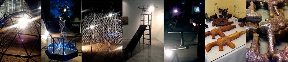
The Juegos Fronteras installation, which was previously shown at the El Paso/Juarez Biennial, shows metaphorical restrictions placed upon our future and youth by the placement of borders in an area dependent on the free flow of cultures. Through imposed restrictions under the guise of safety safety and security, the Playground is rendered useless for those outside and cripples the ability of those inside to truly experience the social interaction and camaraderie the grounds encourage.
El Pan Dulce Vidais an interactive installation blending dark satire and puns with the current views of border violence throughout the country. The installation brings forward issues of border violence and the enticement of the sweet life even at the cost of one’s life.
We hear the opening was a blast and look forward to seeing what is next for Cub3 and the El Paso Art Community.
For more information about Cub3:
CONTACT: ANGEL CABRALES
114 East Mills Ave, El Paso, TX 79901
940-765-6112;
Creator@angelcabrales.com
https://www.facebook.com/TheCubeGallery
10
Feb
Digital Artists on iPad App Art
- By Zoe Spiliotis
- No Comments
During the preparation of our group exhibition, DIGITAL, it became clear that iPad drawing apps were having a big effect on artists and the types of digital works created. Certainly they are appealing to all levels of artists because of their portability and ease of use. Some of my personal iPad favorites have come from artist David Hockney. And although one might think iPad App art is mostly for sketching, it is becoming clearer that these apps can produce a much broader range of art. I asked a few of the artists, Steve Thompson and Jordan Rodgers, from our exhibit to give us their take on App Art.
Why the iPad? or How did you get started using the iPad app for drawing?
Steve Thompson: Clean and portable the iPad became my sketchbook soon after it was launched.
As everyone knows it gives access to a huge amount of apps, some of which are dedicated to art.
My favourite app is Sketchbook Pro. which allows smooth contoured finger painting.
Jordan Rodgers: Since 2011 I’ve been using the iPad to push the boundaries of drawing through utilizing enhancements in modern technology that offer a new perspective in contemporary visual arts practice.
ST: I haven’t used them since taking up the iPad but by big thing was oil on canvas.
What have you found, are the advantages or disadvantages to creating drawings on the iPad?
ST: The biggest drawback is the black screen in sunlight.
The most singular, spectacular advantage to me is layers, this allows you to paint underneath an
existing layer which I’ve always found pretty tricky to accomplish with oil.
JR:I work fast and press hard onto the screen of the iPad, I have been known to break a number of stylus pens so nowadays I tend to work from finger touch and overall I find the latter allows for greater rhythm and flow while drawing the lines machine-gun style.
What do you enjoy most about working on the iPad?
JR: It is how we respond and react to changes in technology that I find thrilling. However, nearly everything we engage with in art at one time or another can be as much described as cutting edge. But as time goes by such technology will become old news and the validity of the artworks itself may be all that remains.
How do people normally react to you work when they find out it is digitally produced?
ST: Wow! how did you do that! If I show them on the iPad.
When seen printed to canvas quite a few people have likened it to acrylic.
Actually, thinking about it, there hasn’t been a negative comment.
JR: It is important to engage with the viewer and draw them into the process of looking. With consideration toward exhibiting my drawings on a small scale handheld device to one that through installation creates an experience almost of stepping into the environment.
How long did it take you to develop your skills on the App until you felt satisfied with the results? I am assuming you had to teach yourself the skills as there really aren’t any drawing classes yet for App drawing. How did you do that?
ST: It didn’t take to long before some pleasing results were coming through, if you have experience with a brush or pencils
it’s only a short step to using your finger! Sorry, that was a bit glib, I quickly discovered through online forums (sketchbook pro has one) that a stylus was a much better ‘finger’ and that one of the joys of the internet is that so many people are incredibly generous with their knowledge.
JR: I draw as both a passion and purpose. My work was good enough for others to follow, ideally that’s what that any artist wants to be isn’t it? A trendsetter. It is desirable, then to be a child of the revolution under the conditions of today’s technological aid by presenting a dawn of drawing in a new age.
I want to thank Steve and Jordan for take the time to ansawer a few of my questions. Make sure to check out the rest of their work and the other artists in our digital exhibition which is up on unframed.us until the end of February 2014.
For more information on them visit:
www.jordanlrodgers.com or @jordanlrodgers
16
Jan
The Best and The Brightest in Scottsdale
- By Zoe Spiliotis
- No Comments
We are thrilled that two of Jean Reece Wilkey’s paintings that just exhibited in Unframed’s Exhibition, Nesting Instinct, were chosen to be in the Scottsdale Artists School exhibition, the Best and the Brightest. Dan Caprario, the operations manager, did a wonderful job of hanging the work and Jean was excited her work was hung near other artists whose work she greatly admirers.
 Jean was able to be at the opening last Friday, 10 January, and it was attended by a steady flow of several hundred art-lookers from 5 until well after 7 pm.
If you don’t know about Scottsdale Artists School, you can check it out to see their roster of professional artists who come from all over the country to teach there. The level of instruction is excellent, the facilities top-notch, and the staff are wonderfully supportive and very, very friendly.
Several pieces sold the first night and a couple sold before the opening including this one of Jean’s. The new owner? An art lover and artist who works for Plein Air magazine. Jean was able meet her and talk with her. After all, we all love meeting the people who are taking home our work.
The show will be up until the end of March so there’s time to get by and see it. Also for the first time this year you can view the show online so you can check out all the artists’ works. If you’re in Scottsdale, make sure you go by the show! Scottsdale Artists’ School, 3720 N Marshall Way, Scottsdale, AZ
07
Jan
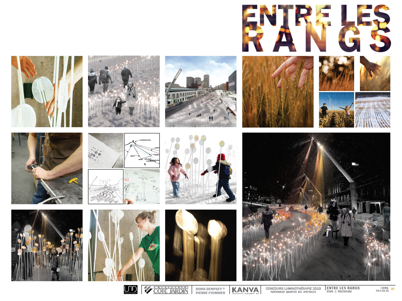
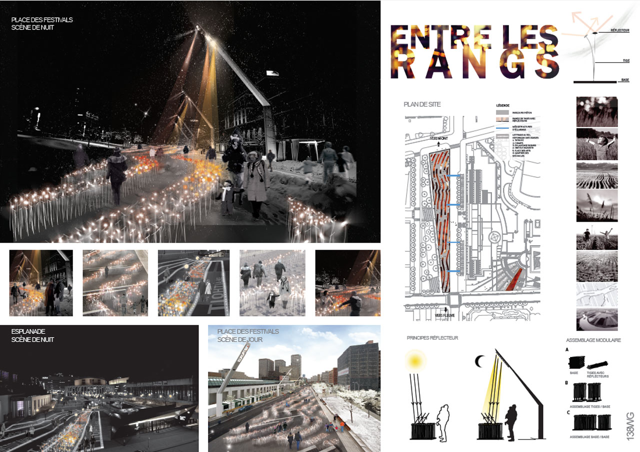
Entre Les Rangs by KANVA
- By Zoe Spiliotis
- No Comments
Back in October of 2013 the Monument-National, the Quartier des Spectacles Partnership announced the two winners of the fourth annual Luminothérapie competition. The two works will enhance the Quartier des Spectacles experience for visitors and Montrealers from December 11, 2013 to February 2, 2014.
“The Quartier des spectacles inspires local creative and talented artists who showcase original and daring works as part of design competitions such as Luminothérapie. Luminothérapie helps to promote Montréal’s international reputation as a UNESCO City of Design, by proposing new ways to occupy and use public spaces, and by promoting Montréal know-how in the field of cultural entertainment. I invite Montrealers to discover new talents in the Quartier des spectacles this winter and to marvel at the imagination of the Montréal creative force,” said Élaine Ayotte, member of the Montréal Executive Committee, responsible for culture, heritage and design.
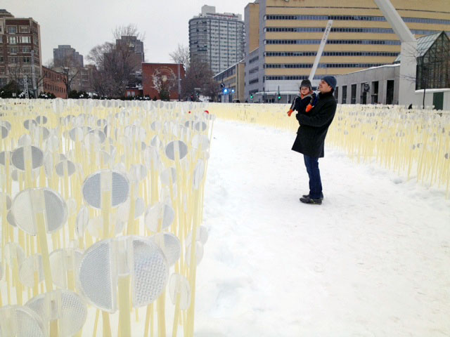
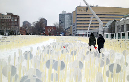
One of the winners was an installation composed of flexible plastic tubs and reflectors, entitled Entre Les Rangs. This installation was designed by a multidisciplinary team led by the KANVA architecture firm. We were lucky enough to stumble upon it in real life. Founded in 2003, Kanva is a multidisciplinary architecture firm that combines architectural design, construction projects and art installations. It approaches every project as an opportunity to tell a story, improve the built environment and broaden the reach of art and architecture.
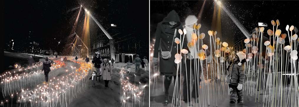
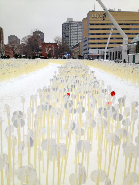
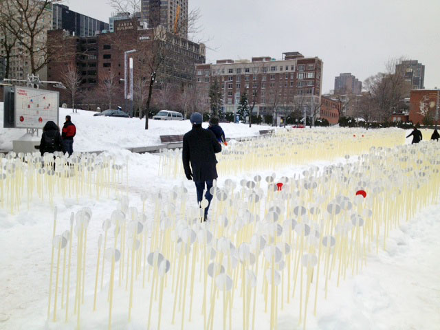
As a large scale urban metaphor for the traditional wheat fields of rural Quebec it creates an instant dialogue between Quebec’s agricultural history and its current urban reality. Wandering through Entre Les Rangs’ thousands of flexible stems you can’t help but feel a childlike awe and fascination similar to the feelings of being completely engulfed in a wide open, timeless space. You find yourself as part of new type of field, one where everything is man-made, but for a moment you forget they are mass produced plastic sticks and somehow you forget it is winter and -4 degrees. In all honesty, I was actually transported, not something installations usually accomplish which is why Entre Les Rangs is so successful. I actually had a flashback to standing in the tall grass fields outside Denton, Texas watching my dogs run through the stalks, bright blue skies, hot sun and a breeze swaying over the grass making it dance. However here I was in a sea of plastic, in more layers than I could count and surrounded by tall buildings and a grey, yet really bright sky. At night I watched the reflectors from my hotel room, sparkle from the lights nearby and delight other visitors to installation. And I felt that same feeling again.
More information can be found at this site. I encourage a visit there.
http://mtlunescodesign.com/en/project/2013-Installations-for-public-spaces
For fun, below are some pictures of us exploring the installation.
11
Oct
Craig Cully: Ardent Proponents of Iridescence
- By Adrian
- No Comments
Craig Cully: Ardent Proponents of Iridescence at Projects Gallery, Philadelphia, PA
by Jean Reece Wilkey
When we think of vanitas, skulls and candles with snuffed flames come to mind. Meant to remind us of the brevity of life and vanity, the memento mori and vanitas themes have been popular with artists from Dutch still life painters to Audrey Flack’s pop updates to Gabriel Orozco’s sensuous checkerboard skull, Black Kites (1997). On the surface Cully’s work may seem more related to the bling of Damien Hirst’s diamond encrusted skull, “For the love of God” whose vanitas imagery both questions our attachment to the material world and sports more than 8000 diamonds, symbols of our obsession with materiality and adornment, and perhaps, of a desire even in this century to buy heavenly “favors”.
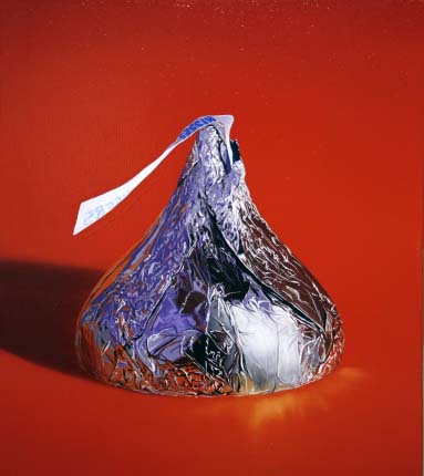
Cully explores vanitas from the consumerist veil of pop culture and kitch. In speaking directly to audiences he says are “conditioned by the ubiquity of Hallmark imagery,” his view of life’s fleeting nature includes the ‘transience of pleasure’ rather than a narrow or more traditional religious view. Witness the chocolate “kisses” rendered large and luscious.
A contemporary painter who lovingly attends to the surface in achieving the magic of implied textures, whose hyper-real images reflect color that is at once bright and right, he has shifted his focus from depicting human interactions to focus on alluding to the consequences of human actions.
His luscious reflections remind me of painters like Jeanette Pasin Sloan, [http://www.williamhavugallery.com/category/jeanette-pasin-sloan/] and the complexity of his composition in Iridescence in Pink, has a congested and appealing feel akin to works by David Le Chapelle. [http://www.featureshoot.com/2012/02/david-lachapelles-twist-on-baroque-still-life-paintings/]
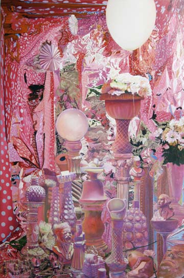
Unlike LeChapelle, Cully’s work retains a casual and random order, a sort of found-composition embodying a certain defiant appeal rather than a contrived arrangement. He controls the surface with great attention to detail while allowing it to subjugate the objects, which are subsumed into an abstract controlled chaos of color and texture.
Cully’s work is currently on display as part of the Arizona Biennial [http://www.tucsonmuseumofart.org/exhibitions/arizona-biennial-2013/] in Tucson through September 29th. Ardent Proponents of Iridescence opens at Projects Gallery [http://www.projectsgallery.com/Cully.html] in Philadelphia on September 6 through October 19th. His work can also be seen on his website. [http://www.craigcully.com/]